We’re so excited for the future of IdeaBase and the new website, which will allow us to continue to effectively promote our services and stay connected to the design community for years to come.
Redesigning the IdeaBase Website from the Ground Up
The term “redesign” is heard quite a lot in any creative agency setting. But what is a redesign really? Is it simply giving the current site a facelift, or does it imply starting over completely from scratch?
From my perspective, an organization should undergo a redesign for the right reasons. Maybe your content doesn’t answer your users’ questions, the design was built from a desktop-first perspective or the backend architecture is unmanageable, for example.
In this case, the staff at IdeaBase (a student-powered design agency run through Kent State University’s College of Communication and Information) faced a similar decision with our own internal agency website. Our site had spent nearly 5 years in a WordPress-powered site and it used a modified purchased theme that had seen few content improvements over the years. Was it time to redesign from the ground up? How would we counsel clients who were in the same situation?
In the end, our team decided to begin planning in Summer 2015 for a redesign due to:
- Our messaging and branding, which had become disjointed and lacking a clear voice.
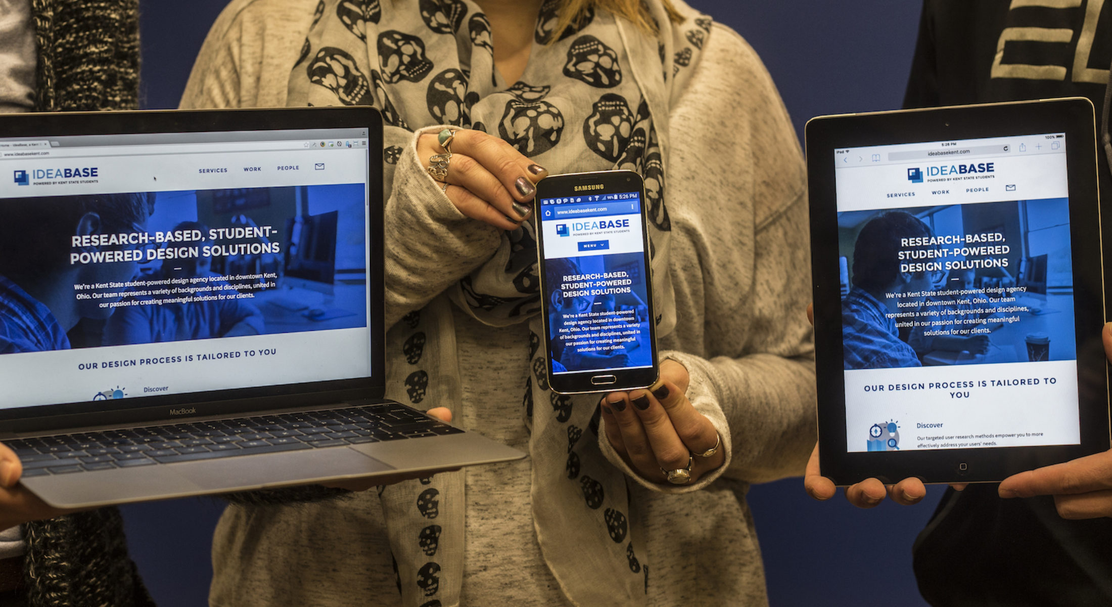
- Our design and layout was outdated, without a good call to action. The design, while responsive, did not scale or prioritize content well for small-screen devices. We wanted a place where we were excited to send clients to review our work.
- Our content management system and theme, which was bundled with many third party plugins and a less-than-ideal structured content workflow.
- Slow performance, due to the large amount of JavaScript plugins and non-effective use of a content delivery network.
While we could have attempted to restructure and update the existing system and theme, we felt the challenge to be worthwhile, allowing us to try new technologies and processes while developing a site that could be shown to clients as an example of what’s possible.
BUSINESS NEEDS, COMPETITIVE ANALYSIS AND BRAND RESEARCH
We started the process by meeting as a team (this was easy, since we were also the “clients”), to make a list of business needs for the website. This helped establish design goals.
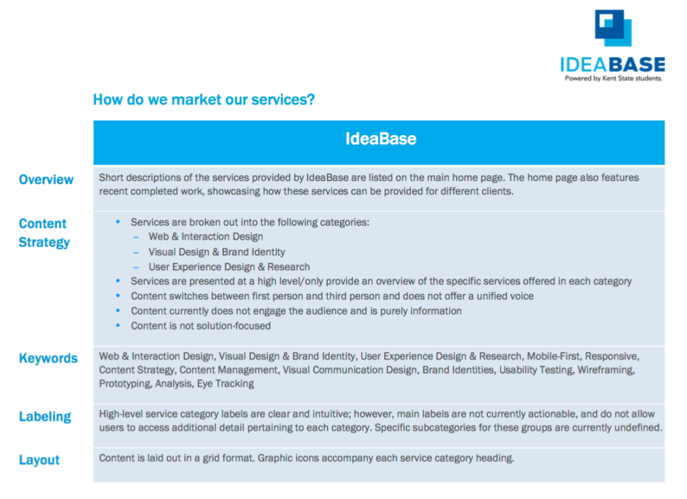
We also identified a list of competitors and aspirational websites. We were sure to include both local and nationally-known agencies, with a focus on agencies that concentrate on user research and eyetracking, a service area we wanted to promote more heavily.
Our User Experience Designer and Information Architect, Callie Sullivan (User Experience Design student), analyzed our competitor websites (as well as our current website) and compared messaging and layout styles across each.
“Unlike the majority of our projects in which we are immersing ourselves into our clients’ business goals, branding and vocabulary, for the IdeaBase redesign, we needed to take a step back,” Callie said. “In order to make sure that our design and development efforts weren’t clouded by our own biases, we decided to kick-off our redesign with a round of competitive research.”
At the same time, our Account Managers (Communication Studies and Journalism and Mass Communication students) reached out to a few past clients and student employees by phone to get their feedback on proposed messaging and calls to action. The clients’ feedback helped us write content that described IdeaBase and no one else.
Our research helped inform our decision to organize our services into the 3 themes Discover, Design and Refine and develop the “Let’s Make Something Great Together” call to action.
I DEVELOPED A STYLE GUIDE THAT MORE CLEARLY DEFINED OUR BRAND AND VOICE IN A WAY THAT RESONATED WITH OUR INDUSTRY AND OUR MISSION.
CONTENT STRATEGY AND SKETCHING
As we were finishing up the brand research, Callie was already off to work collaborating with me on an information architecture that fit our content goals, with simplicity in mind. We used Google Drive to divide content into sections, as well as write/edit that content. Existing content came from many places, including our current website, promotional materials and viewbook and videos.
We took the best content out of each, threw out content that didn’t meet our goals and developed new content to fill in the gaps. Photos, which often get forgotten during the content process, were taken by Chris Uhler (headshots – User Experience Design student), Todd Thompson (headshots and environmental photos – Journalism and Mass Communication student) and Mario Fasolo (project photos – Visual Communication Design student).
In the end, we had a rough content prototype built in Google Drive, even before a single design concept had been developed. We continued to modify content throughout the entire project.
As Callie worked on refining the content, I worked on sketching out the general user flows and mobile-first content layouts on paper. Callie turned these sketches into more polished wireframes later.
Callie described the process: “I developed a style guide that more clearly defined our brand and voice in a way that resonated with our industry and our mission. Once the style guide was refined, I led the content strategy efforts, modifying existing content to align with our style guide. I used this content to generate mobile-first wireframes to prioritize content delivery across all channels.”
I WAS ABLE TO GET A BETTER UNDERSTANDING OF HOW BUILDING A FULL SITE FROM SCRATCH REALLY WORKS.
DESIGN AND DEVELOPMENT
John Vrhovnik (Visual Communication Design student), our visual designer didn’t have to wait for the content to be finished. After reviewing the rough sketches and competitive research, he developed a set of style tiles that showed our proposed typography, color and style choices for the website. The style tiles still today match the website style, and helped inform our style guide for print work as well.
Having just learned HTML and CSS in the Responsive Web Design class, John quickly turned the static style tiles into an HTML/CSS style prototype so that we could see the styles in the browser and make revisions from there.
After we’d decided on our visual direction, John began developing static mockups week-by-week of different interface components, starting with the home page components and then working through services, profiles, blog posts and more. John also produced some really cool, custom-drawn vector graphics that are used throughout the website. We also took advantage of new features in CSS3, such as animations and live image blend modes, to make the site more dynamic.
After we’d decided on our visual direction, John began developing static mockups week-by-week of different interface components, starting with the home page components and then working through services, profiles, blog posts and more. John also produced some really cool, custom-drawn vector graphics that are used throughout the website. We also took advantage of new features in CSS3, such as animations and live image blend modes, to make the site more dynamic.
At the end of each day, John would post a rough Illustrator mockup to Basecamp, which I then added to our HTML/CSS/PHP prototype repository hosted on GitHub. This continuous design/development helped us immediately see how the design would scale and come together in the browser.
We ended up with a working prototype that represented the various templates to be used on the website. This was helpful when Chris U. began usability testing the prototype (in three rounds). We had something that participants could actually use and test on multiple devices, even if it wasn’t fully complete. Chris said, “that feedback shined a light on a few potential user issues that we were able to resolve early on in the design process.” Based on usability testing results, we made adjustments to the site navigation and content.
John also noted, “after working on the website closely with Chris [Hallahan] for several weeks, I was able to get a better understanding of how building a full site from scratch really works. One of the benefits of this team effort was that Chris, as a developer, has a lot of knowledge about design – and I, as a designer, have a bit of experience in developing. This strengthened our communication during the process as we transitioned my page patterns from Adobe Illustrator into functioning web pages in HTML and CSS.”
I ENJOYED WORKING WITH A NEW CONTENT MANAGEMENT SYSTEM, AND FULLY DEVELOPING A BACKEND FOR A SITE.
CONTENT MANAGEMENT SYSTEM
As the content was being finalized (remember that this isn’t a waterfall process!), Reilly Hawkins, our web developer (Computer Information Systems student), began mapping out the content into fields and content types. We took a chance and selected the relatively new Craft CMS as our content management system because of its design flexibility and intuitive templating language. Craft gives designers and developers absolute control over every part of the website implementation (there are no “themes”) and provides a great, structured editing experience on the front-end.
As I developed the front-end prototype templates, Reilly integrated the raw HTML code into the actual CMS templates. Since our CSS and JavaScript assets were shared between both the development and production environments, we saw changes to the CMS templates instantly!
Reilly commented on working with Craft: “I enjoyed working with a new content management system and fully developing a backend for a site from scratch. In the future, I think Craft will become a very simple, easy to use CMS and is a good thing to have on a resumè.”
Once Craft was in a state ready for content entry, the entire team worked together to build out the site content and pages, including migrating all of our projects, blog posts and staff profiles to the new system.
Chris U., who had worked on conducting usability testing and building out the content in the CMS said, “It was nice to work directly with Reilly, our web developer. That allowed me to give instant feedback into what was and wasn’t working during the build out phase of the website, and he was able to answer all the questions I had during the build out.” Chris noted, “being involved with the project from beginning to end was educational and I now am able to better appreciate a well thought out and built CMS, and how valuable it can be to website development.”
As we were finishing up content entry, I also worked to improve performance on the site, setting up caching via CloudFlare, compressing and minifying assets and implementing responsive images to reduce mobile data use.
IT WAS NICE TO WORK DIRECTLY WITH OUR WEB DEVELOPER. THAT ALLOWED ME TO GIVE INSTANT FEEDBACK INTO WHAT WAS AND WASN’T WORKING DURING THE BUILD OUT PHASE.
OUR END RESULT
We launched the website on Valentine’s Day 2016. To build up excitement for the launch, our designers Rachel and Martha (Visual Communication Design students) developed some great social media teasers, which we promoted on Facebook, Twitter, LinkedIn and Instagram.
The entire redesign process took about 5 months from beginning to end. You can take a detailed look at all of the documents in the IdeaBase Web Redesign Retrospective.
We’ve had great feedback on the redesign so far, and we are already thinking of ways to iterate and improve upon the design and functionality. I’m happy at the amount of collaboration among the team members during this project, who each contributed their own unique abilities and talents across a wide variety of disciplines.
We’re also hosting the IdeaBase GitHub repository out in the open so that anyone can take a look at the latest projects and revisions we’re working on.
FOR THE FUTURE
A redesigned website is only as good as its maintenance plan. As a team, we worked to develop better content governance roles, with plans on how to add new work, new student staff members and blog posts. We’re also now in the process of turning all of our brand assets and content guidelines into an online IdeaBase Style Guide, which will live alongside our website in Craft. The Style Guide will help keep content and design elements consistent across all of our communications materials.
I’m really thankful to the core design team, as well as Kristin Dowling (Business Development Manager), Quintin Steele (IdeaBase Creative Director), and the team at CCI for their help and guidance along the way.